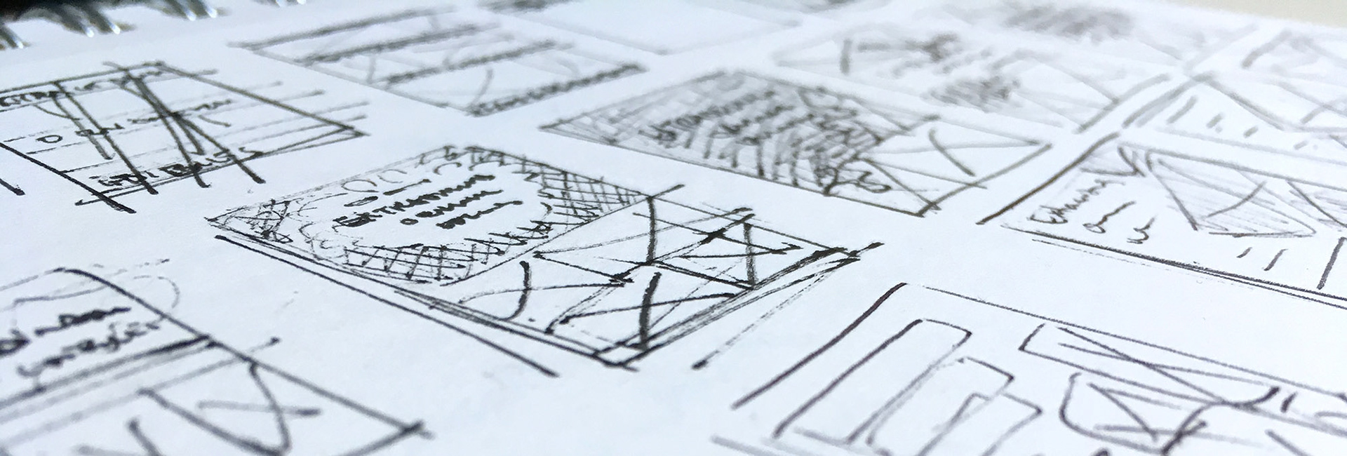
Book cover design is some of the most iterative work I do having to go through the eyes of an entire publishing team plus the author, and any creative and business stakeholders before it is finally approved and sent to press.
Challenge
The goal is to capture the essence of the book, appeal to the target audience, stand out from the crowd of similar titles both in the bookstore and at a small size when viewed on mobile or desktop.
Process
• assess cover image options (may be provided for me or I may look through the book for options)
• conduct a competitive analysis to see what other books my cover may be seen alongside
• look for inspiration and create thumbnail layout concepts
• explore typefaces
• conduct a competitive analysis to see what other books my cover may be seen alongside
• look for inspiration and create thumbnail layout concepts
• explore typefaces
Once the client reviews the concepts, they may choose one or two favourites and have some suggestions to improve or try until we get to the final cover.
The Power of Pulses
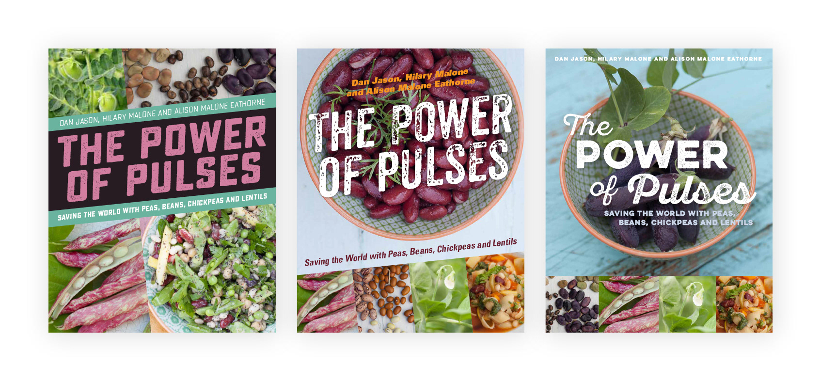
The photography was especially lovely for this book. I never thought beans could look so pretty! In my cover concepts, I also wanted to play with the dynamic-sounding title.
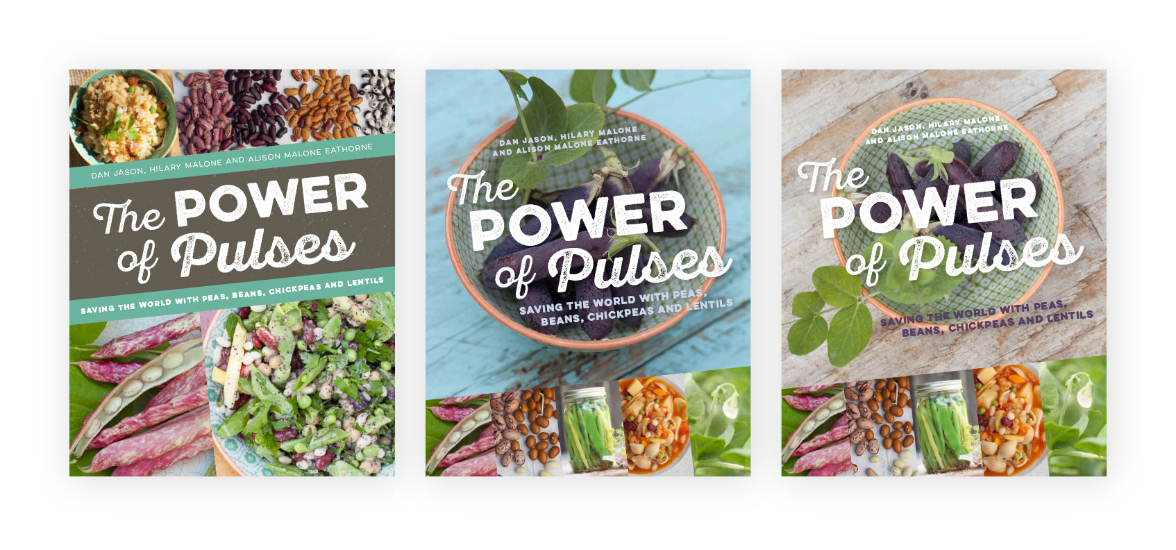
In their brief, they were going for a “bohemian-hippy garden party” with more subdued colours in the food styling so the punchy colours in the previous samples didn't quite fit.

The client liked the mixed typefaces but wanted to see everything straightened out with a softer palette overall.
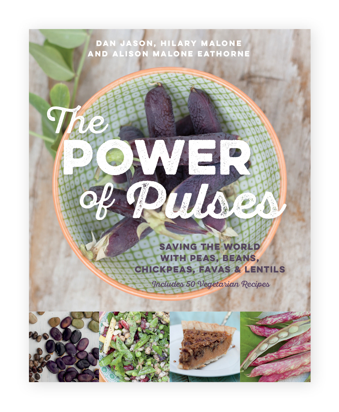
The final cover
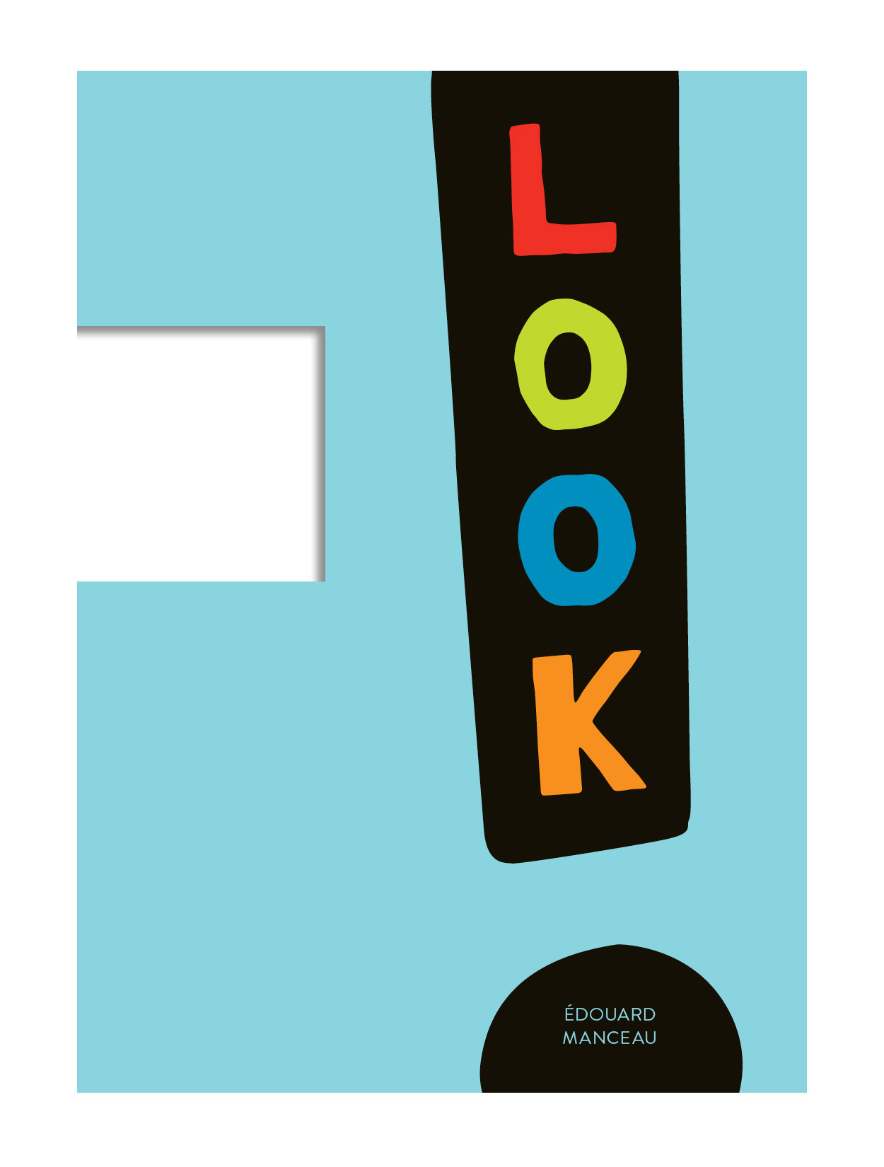
Look!
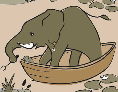
This is an oversized board book with a rectangular “viewfinder” cut out of it. The book invites the reader to look for things in the world around them that visually or texturally matches the concept on the page: tall or short, near or far, fuzzy or shiny. The illustrations are simple (much like the ones on the first cover) and are generally placed on a stark black background.
My role was to typeset the English translation of this book and repackage the cover for the Canadian market.
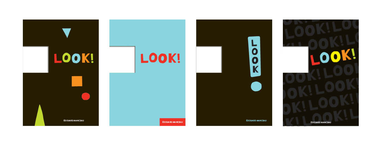
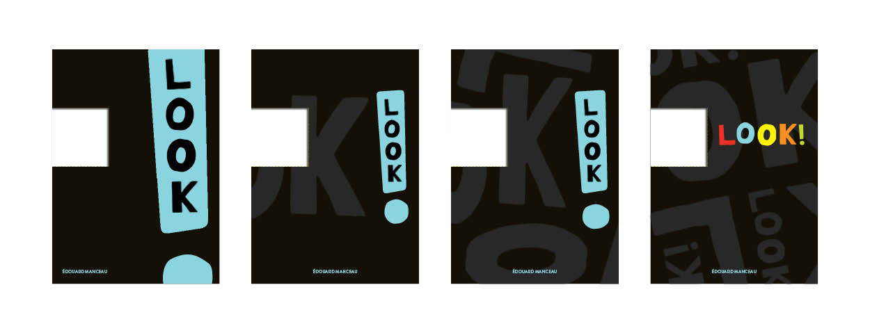
The client liked the black covers but weren't in love with any of the initial concepts. I submitted another set of concepts—the favourite featured an oversized exclamation mark. The feedback was that exclamation mark was a bit too big and the client didn't think a black cover for a preschooler’s book would go over well in the Marketing department.

I made the exclamation mark smaller and the cover simpler and more colourful. The client was happy and sent the blue cover on the right to be approved by the original publisher in France.
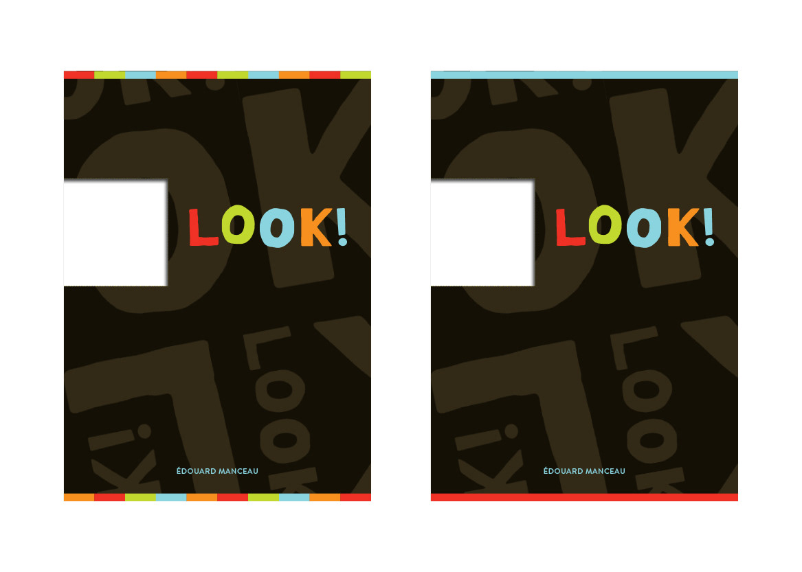
But a few days passed and my client, who loved the concept realized that the design spoke more of the exclamation mark than the viewfinder. I was asked to revisit the less bold concepts, go back to black which they continued to be drawn to, but try a few splashes of colour to brighten up the cover.
Several drafts later, we ended here and sent this to France for approval. But the French publisher and illustrator/author had already approved of—and really liked—the large exclamation mark from the earlier iteration.
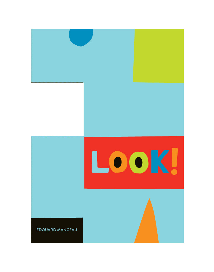
This is the final cover. Really!
We reconsidered the oversized exclamation mark concept once more and after a few more iterations finished here. The exclamation mark bleeding off the edges creates interesting shapes, and seems to de-emphasize that it is an exclamation mark. The black matches the interior and the large area of colour keeps it cheerful.